If you have not worked through the simple tutorial, where I introduce you to Bear step by step with very simple examples, then I strongly recommend that you at least read through it first.
All the commands I use below are listed here.
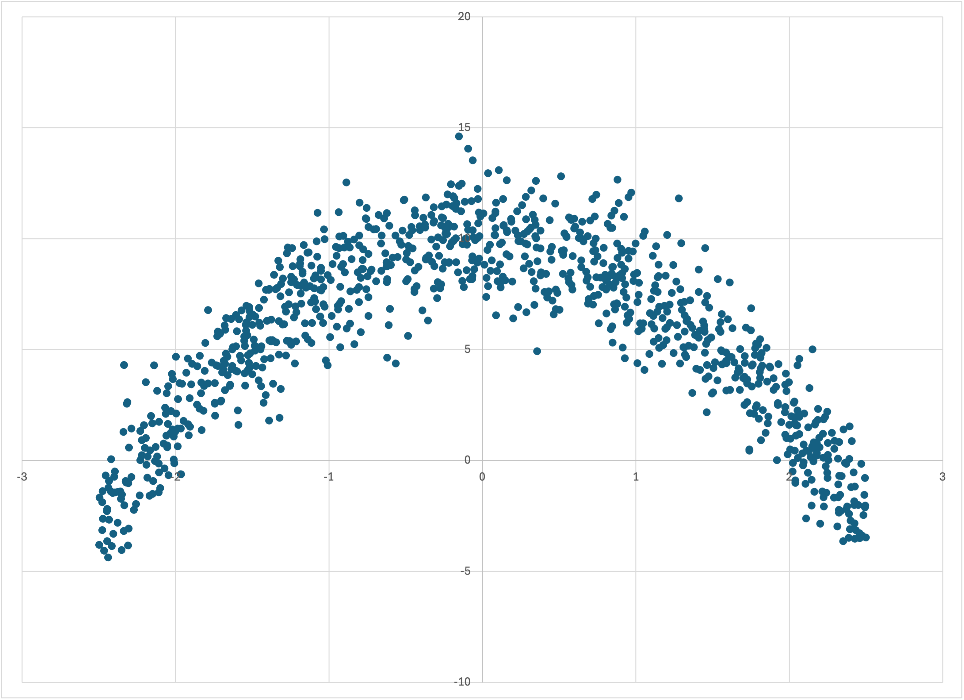
The datasets I showed you in the simple tutorial were all either trivial, or else based on a linear dependence of the label on the feature. Let’s immediately move to a dataset that is manifestly nonlinear, by modifying our command for generating linear-1k.csv by removing the linear weight term with --weight=0 and adding a quadratic term with --quadratic=-2:
$ simple_bear_tutorial_data quadratic.csv -r19680707 -t1000 --weight=0 --quadratic=-2
This yields quadratic.csv:
Scatterplot of quadratic.csv
If we just run memory_bear on this dataset in the same way that we did in the simple tutorial,
$ memory_bear quadratic.csv 10s -dl1 -oquadratic-predictions.csv
then we find that Bear’ has the same properties as it did when the underlying relationship was linear, but now it follows the parabolic shape:
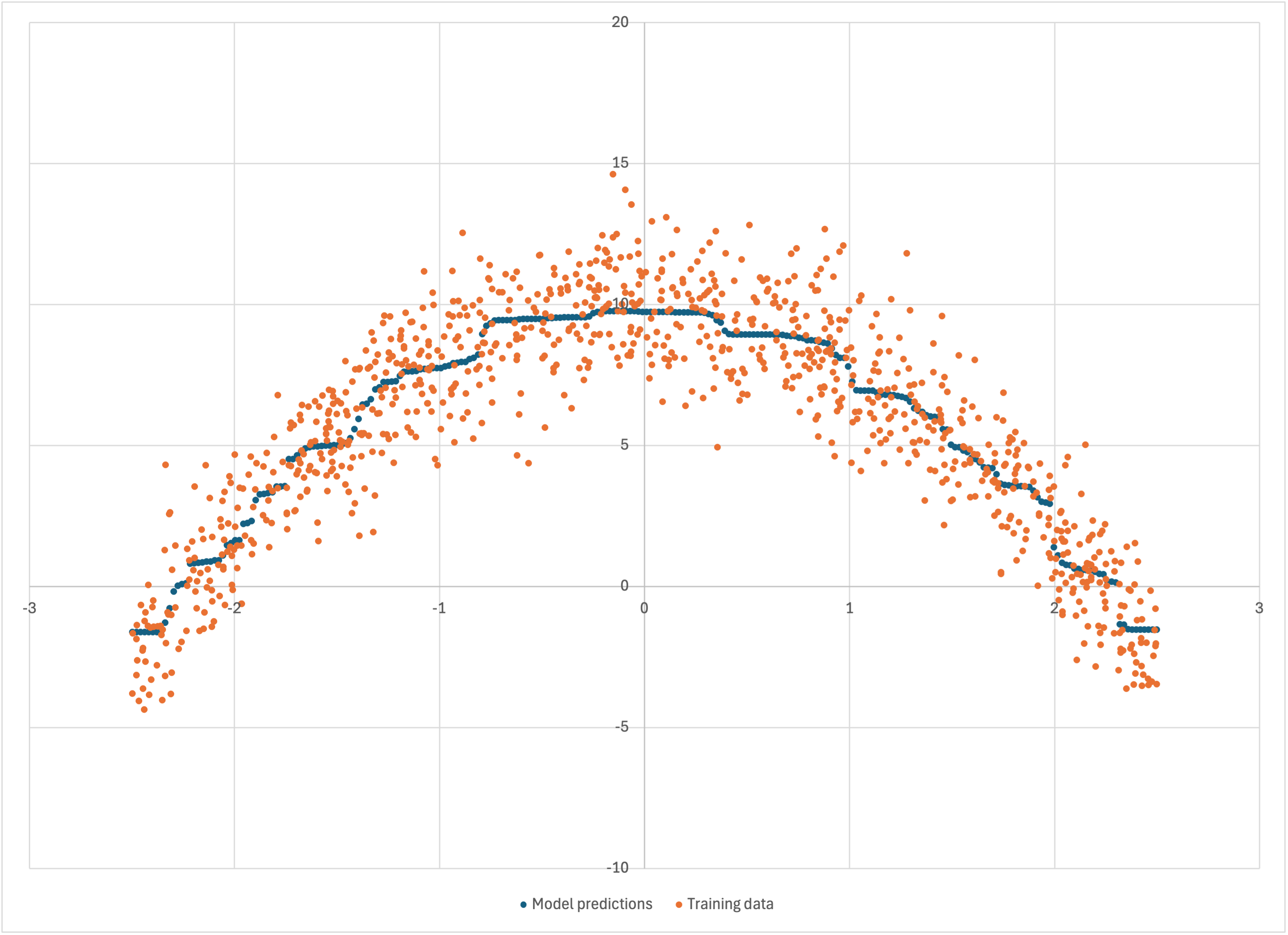
Scatterplot of quadratic-predictions.csv
So Bear models nonlinear data without us having to tell it what to do. In statistical terms, Bear is “nonparametric”: it makes no assumptions about the underlying joint distribution between the features and the label.
Of course, a parametric method like linear or quadratic regression will always yield a more accurate model, if you know in advance that the underlying distribution is linear or quadratic. In those situations you would be silly to use Bear. But for many real-world machine learning problems we don’t a priori know how the label might depend on any of the features; this is what the “machine” is “learning.” In such cases, Bear may be a good tool for you to use.
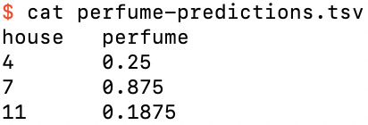
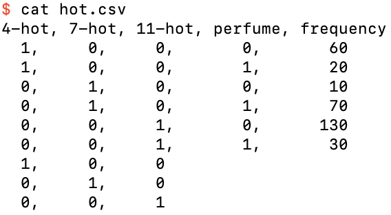
Let’s now turn to another type of problem that linear regression is not suited to: classification. For concreteness, consider the following hypothetical scenario: Imagine that we have data for three different types of house in a city in western Germany. Let’s label these three classes of house by the integers 4, 7, and 11. Let’s further imagine that we have surveyed a number of such houses, asking each if anyone in the house owns a particular brand of perfume. We put the results into the table perfume.csv:
The binary classification dataset perfume.csv
Note that this time I have included a header row of column names, as well as a frequency column that specifies the number of houses of house type house that gave the binary answer perfume to whether anyone in the house owned that brand. (I’ve made all the frequencies multiples of 10 just to make it easy to mentally do the math in the following.) I’ve also added three prediction rows, one for each of the house types 4, 7, and 11.
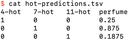
Let’s run Bear on this data. You can look up the help screen for the options to specify a header row and frequency column:
$ memory_bear perfume.csv 10s -H -L perfume -f -C frequency -o perfume-predictions.tsv
yielding the predictions
Bear’s perfume-predictions.tsv
We see that the prediction for house type 4 is just 1/4, for type 7 is 7/8, and for type 11 is 3/16. Note that these are just the relative frequencies of the original data—namely, 20 out of 80, 70 out of 80, and 30 out of 160 respectively—or in other words, the empirical probabilities.
Bear predicts probabilities for classification data without us needing to do anything special.
It seems, though, that Bear has taken the empirical probabilities “at face value.” You can confirm this if you tell Bear to save the model file, and inspect it: there is just a single hypercube, and the BearField object has transitions between each of the three feature values in the training data. This is because there is enough data in this dataset that Bear always concludes that it can consider each of the feature values to be statistically significantly different from each other.
You might remember that Bear’s default loss function is MSE. Isn’t log loss usually used for classification problems?
It is easy enough for us to change to that loss function:
$ memory_bear perfume.csv 10s -HLperfume -fCfrequency -operfume-log.tsv -nLOG
But its predictions are the same as for MSE:
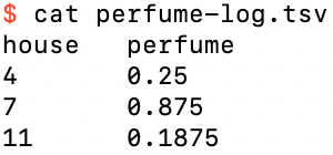
Bear’s predictions using log loss
This is because for both MSE and log loss it is an elementary result that the predictions that minimize the loss function are the expectation values, here based on the empirical probabilities, and our data in this example has enough statistical significance that each category of house is modeled separately. Using log loss does cause Bear to modify extreme probability predictions near 0 or 1 to make them somewhat conservative, because the log loss function penalizes errors in those ranges with unlimited harshness, but that is the only difference as far as Bear is concerned.
If we choose the balanced log loss function, on the other hand,
$ memory_bear perfume.csv 10s -HLperfume -fCfrequency -operfume-balanced-log.tsv -nBALANCED_LOG
then the results are different:
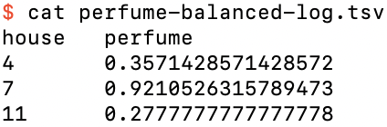
Bear’s predictions using balanced log loss
This is because balanced log loss effectively ignores the actual fraction of labels that are 0 or 1 in the input data (here, 200 / 320 = 5/8 and 120 / 320 = 3/8), and “pretends” that they are actually equally likely. For this example, this effectively scales down the weight of all ‘0’ labels by a factor of (1/2) / (5/8) = 4/5, and scales up all ‘1’ labels by a factor of (1/2) / (3/8) = 4/3, so that, for example, for house type 4 the “effective frequencies” for ‘0’ and ‘1’ are 48 and 26⅔ respectively, so that the “effective mean” that it computes for house type 4 is 26⅔ / 74⅔ = 5/14 ≈ 0.3571, as shown in the table above.
Note that Bear performs this transformation automatically, without needing to throw away any of the actual input data in its calculations of statistical dependence and significance. (It actually calculates the same probabilities as with the other loss functions, and only transforms these in a final step when you ask for its predictions.)
Let’s now look at the same dataset, but with all the frequencies divided by 10, in perfume-less.csv:
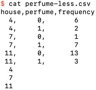
The dataset perfume-less.csv
Running Bear on this data, using the default MSE loss,
$ memory_bear perfume-less.csv 10s -HLperfume -fCfrequency -operfume-less-predictions.tsv
yields perfume-less-predictions.tsv:
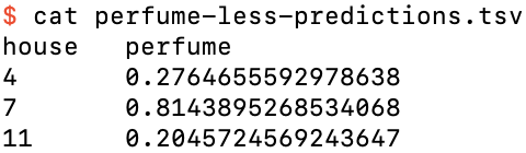
The predictions for perfume-less.csv using MSE loss
(Your results might vary slightly from these.) We see that the predictions are now not just the empirical probabilities, but rather have been “dragged” somewhat towards each other. In this case, there is not enough data for Bear to land on the fully-distinct hypercube every time it does an update; rather, if you save the model file and inspect it, you will find that it does so only about 86% of the time. Indeed, in 9% of updates it finds a trivial model! For most of the remaining 5% of updates it decides to put a transition between house types 7 and 11 only (at a feature value of 9).
The same is true if we use log loss:
$ memory_bear perfume-less.csv 10s -HLperfume -fCfrequency -operfume-less-log.tsv -nLOG
which yields perfume-less-log.tsv:
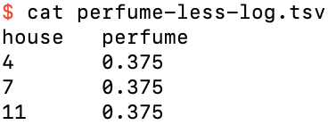
The predictions for perfume-less.csv using log loss
And finally, balanced log loss,
$ memory_bear perfume-less.csv 10s -HLperfume -fCfrequency -operfume-less-b-l.tsv -nBALANCED_LOG
which yields perfume-less-balanced-log.tsv,
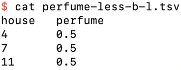
The predictions for perfume-less.csv using balanced log loss
which has likewise “dragged together” slightly the predictions of perfume-balanced-log.tsv above.
Let’s go back to the full perfume.csv, and create perfume-missing.csv by adding two extra training rows for examples where we don’t know what the house type was, and an extra prediction row for that missing feature value:
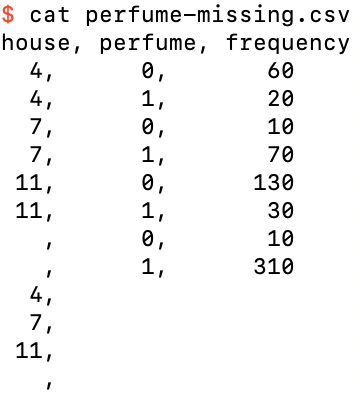
The dataset perfume-missing.csv
Running this through Bear,
$ memory_bear perfume-missing.csv 10s -HLperfume -fCfrequency -operfume-missing-predictions.tsv
it produces the expected results
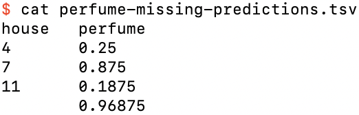
The predictions perfume-missing-predictions.tsv
where the prediction if we are missing the house feature value is just 31/32, as expected from the data.
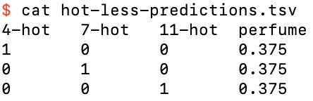
To this point we have encoded the three different categories of house type as the arbitrary numerical values 4, 7, and 11. A more standard way of representing this categorical feature is with one-hot encoding:
The dataset hot.csv, a one-hot encoding of perfume.csv
where the categorical feature house has been replaced by the three binary one-hot features 4-hot, 7-hot, and 11-hot. We have now moved beyond bivariate data, because we have three features and one label, i.e., four variables in total. Regardless, we can still just ask Bear to model this data:
$ memory_bear hot.csv -Hl3 -fc4 10s -ohot-predictions.tsv
We see that its predictions, in hot-predictions.tsv, are the same as for perfume-predictions.tsv:
The predictions file for hot.tsv
It looks like Bear has just done a four-dimensional generalization of what we saw it do in the simple tutorial. We could look at what Bear actually built by saving the model file and inspecting it using bear_model-details, but I’m going to show you a slightly different way: with the --details-filename option, which saves the same details as the non-verbose version of bear_model-details to the specified filename:
$ memory_bear hot.csv -Hl3 -fc4 10s -ohot-predictions.tsv
-Dhot-details.csv
which yields
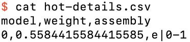
The model details file hot-details.tsv
We see that Bear has chosen a single model that uses features 1 and 2 to model the residuals of the empty model. But why didn’t it use feature 0?
Well, one-hot encoding contains a redundancy: one of the features has to be hot. Thus, any of the models e|0-1, e|0-2, and e|1-2 that uses two of the three features is just as good as the model e|0-1-2 that uses all three. Bear chooses the simplest model that it can that minimizes the loss, and it considers a model with two features to be simpler than one with three. It therefore randomly selects one of these three models with two features. Indeed, if you run Bear multiple times, you will see that it chooses which two features to use in its final model randomly.
If we create the one-hot encoded version of perfume-less.csv, namely, hot-less.csv:
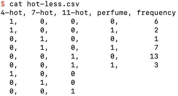
The dataset hot-less.csv, a one-hot encoding of perfume-less.csv
then, running Bear on it,
$ memory_bear hot-less.csv -Hl3 -fc4 10s -ohot-less-predictions.tsv -Dhot-less-details.csv
we now find that its predictions in hot-less-predictions.tsv are not “dragged in” from the empirical probabilities:
The predictions for hot-less.csv
Essentially, by one-hot encoding the categorical feature we have given Bear more “structure” in the “schema” of the training data, giving Bear less latitude to merge “adjacent” values of the original feature field. Whether this is better or worse probably depends on whether you want to consider the original feature field to be ordinal or categorical; here, I would argue that it should be categorical, since the numbers 4, 7, and 11 were merely arbitrary labels rather than quantitative amounts.
We have seen above that Bear can directly model continuous but nonlinear bivariate data, which we can easily visualize on a scatterplot, and binary classifcation data with either a categorical feature or multiple one-hot features, which we can view easily in tabular form. What about continuous nonlinear data with more than one feature?
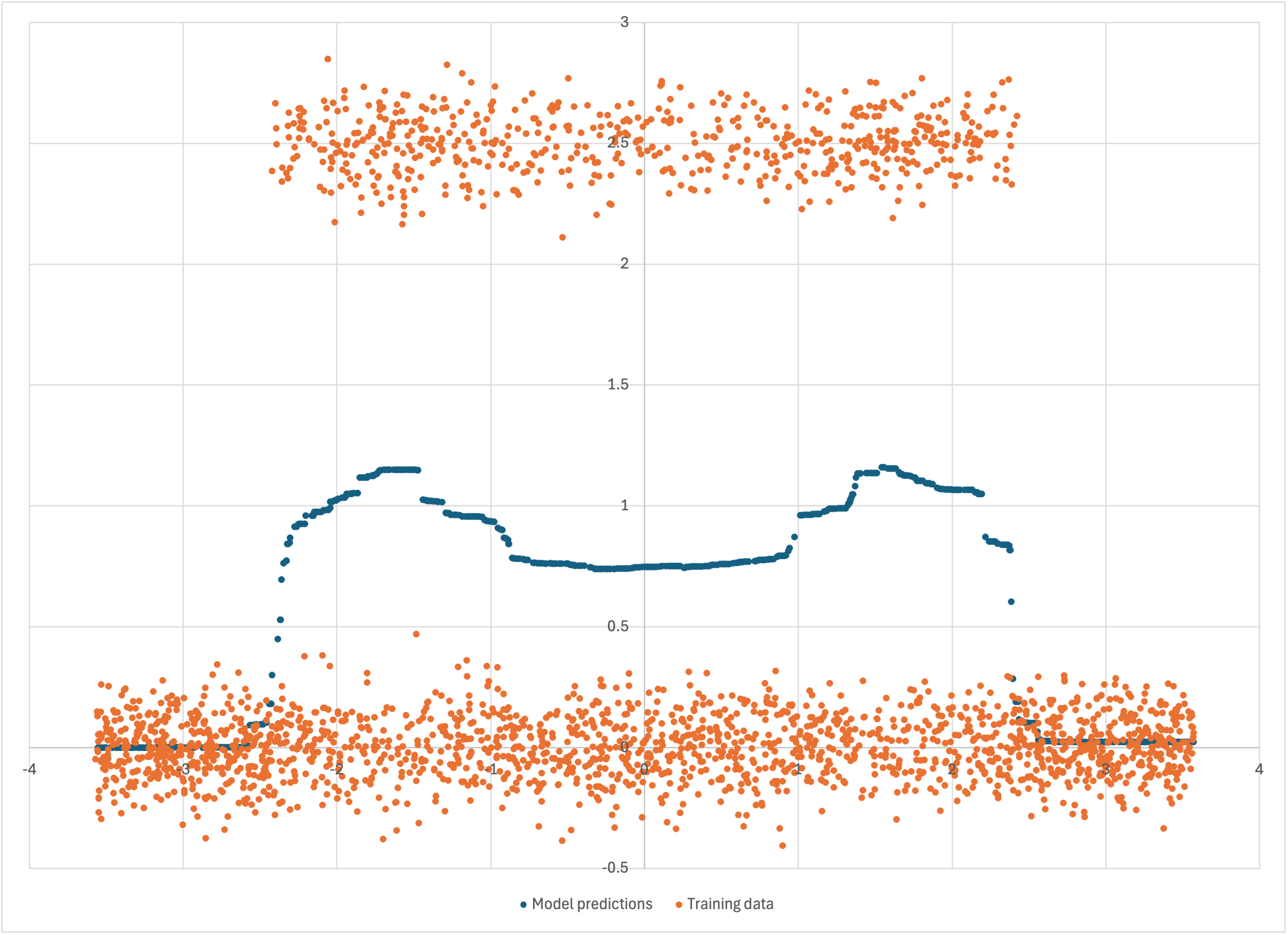
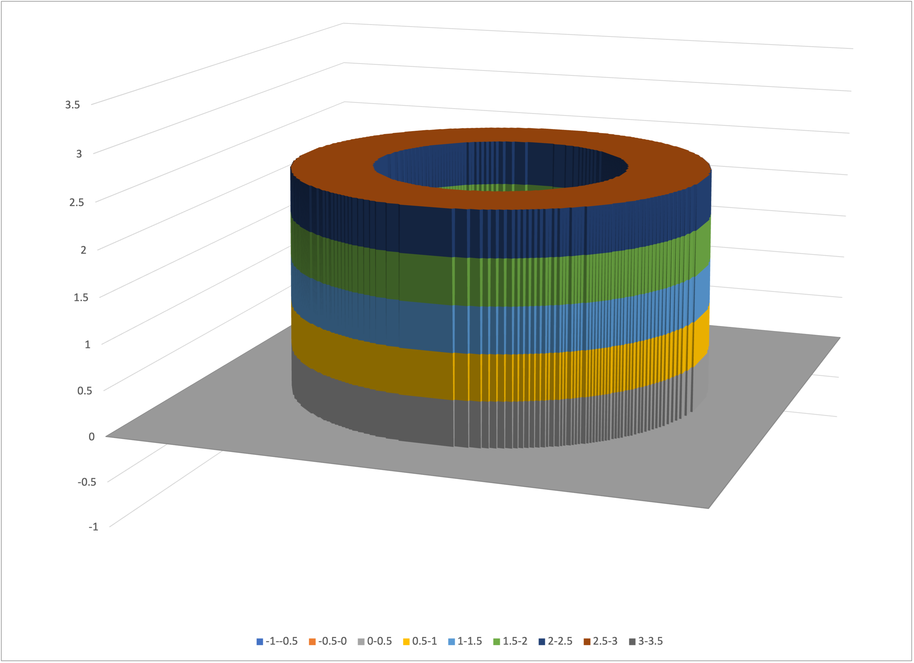
As a simple but nontrivial example, let’s assume that we have trivariate data with one label z that depends on two features x and y. For simplicity, imagine that the true z is equal to 2.5 within an annulus (ring) of outer diameter 5 and inner diameter 3 in x–y space, and zero otherwise:

The true value of z is 2.5 in the blue annulus and zero in the white areas
We can make our visualization of z(x, y) concrete by cutting off a 2.5 mm length of brass tube that has a 5 mm outer diameter and 3 mm inner diameter:
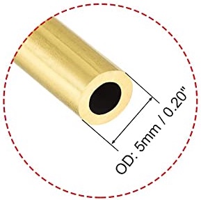
The brass tube that helps us visualize z(x, y)
We place this piece of brass tube on the ground somewhere:

The piece of brass tube, sitting on the ground
The value of z at any (x, y) position is the height of the top of the piece of tube, 2.5 mm, or the ground level z = 0 mm for those (x, y) positions that have no brass above them.
The piece of brass tube actually looks similar to the Hirshhorn Museum:
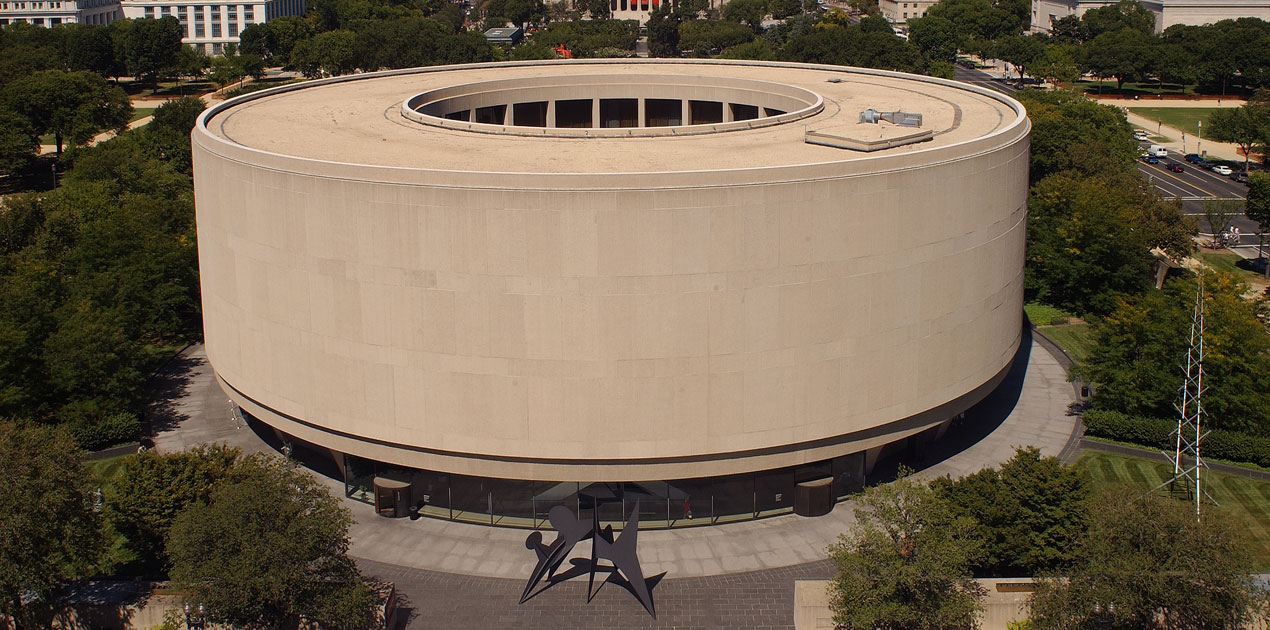
The Hirshhorn Museum
except that it doesn’t have the Hirshhorn’s “stilts” at its base. You can use either physical object to help you visualize z(x, y).
To make our mathematical representation of this piece of brass tube visualizable without special software, we will use x and y coordinates restricted to a square grid. Bear doesn’t require this; it just means that we can use a program like Excel (or any other program you choose to use) to create a surface map for us. On the other hand, we can still add some gaussian noise to the height z to represent real-world measurement noise.
If you have built Bear, then you have a program that will generate this data file for you:
$ intermediate_bear_tutorial_data tube.csv 255 tube-x.csv 50 -r 19680707
The first argument, tube.csv, is the name of the file that will be created with this trivariate data in it. The second argument, 255, specifies how many samples will be on each side of the regular x–y grid; I have chosen 255 because that’s the maximum side length that Excel can handle for a surface chart. Thus the file tube.csv contains 255 x 255 = 65,025 rows of trivariate training data representing the height of the piece of tube or the ground, as the case may be, plus some gaussian noise. It then contains another 65,025 rows with the same (x, y) values as testing data: for simplicity, we are only asking Bear for its predictions for the same x–y grid (although of course in practice we could ask for predictions at any values of x and y).
In addition to this, the program creates a dataset representing the x–z projection of the full (x, y, z) dataset, that I will use below. (By rotational symmetry, the y–z projection is fundamentally the same.) The third argument, tube-x.csv, specifies the filename of this projection, and the fourth argument, 50, the number of samples per side for it; it will be useful for this to be both smaller than and greater than what we use for the full trivariate dataset. Because we don’t have the restrictions of Excel surface charts for this bivariate x–z projection data, the x values are randomly dithered, which will also help with the visualizations below.
Let us start with the bivariate x–z projection dataset tube-x.csv. Opening it in Excel,
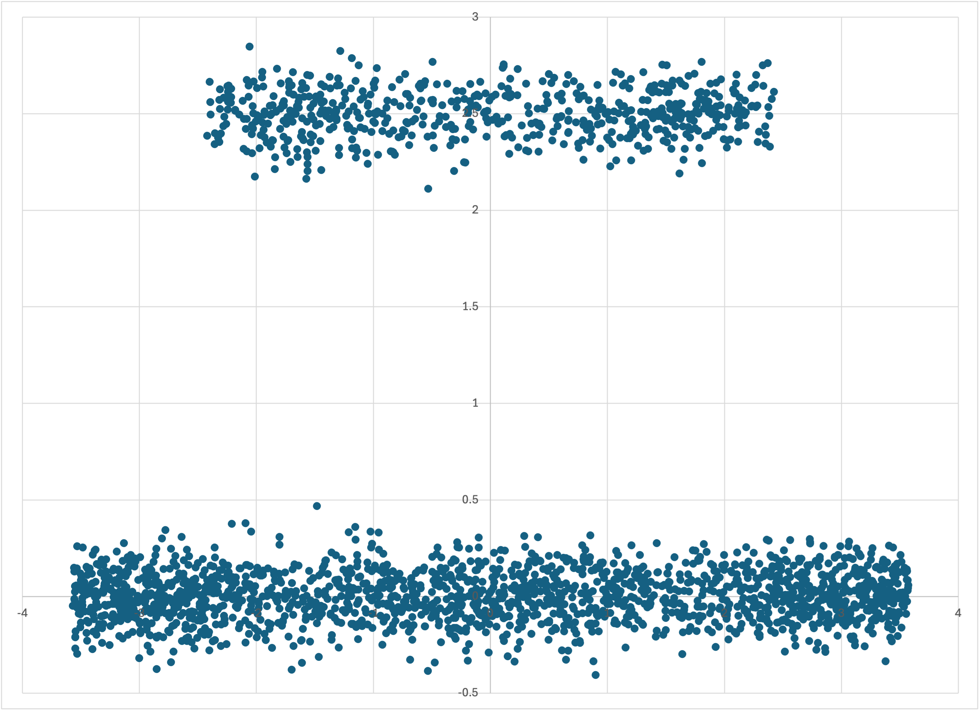
The data in tube-x.csv
we can see immediately why this dataset would be a challenge for machine learning. Its symmetry in x means that linear regression would have been useless from the outset. But it’s clearly also bifurcated according to some “hidden” variable—which we know is just the depth, y. If we run Bear on this dataset in debug mode,
$ memory_bear tube-x.csv -dl1 10s -otube-x-predictions.csv
and look at its predictions, in tube-x-predictions.csv,
Bear’s predictions for tube-x.csv, with the training data
we see that it has figured out that the “edges” of this “brass tire” (or “wagon wheel”) are denser, when viewed side-on, than the middle (and that this density increases as you move from the “outside wall” of the tire to the “inside wall”). This model represents with higher resolution the mean value of z as a function of x.
By circular symmetry, we know that the y–z elementary model is going to look the same.
Let’s now turn to the full trivariate dataset, tube.csv. I supply another program that reformats this data into a form that we can directly graph using Excel:
$ intermediate_bear_tutorial_reformat tube.csv 255 tube-excel.csv
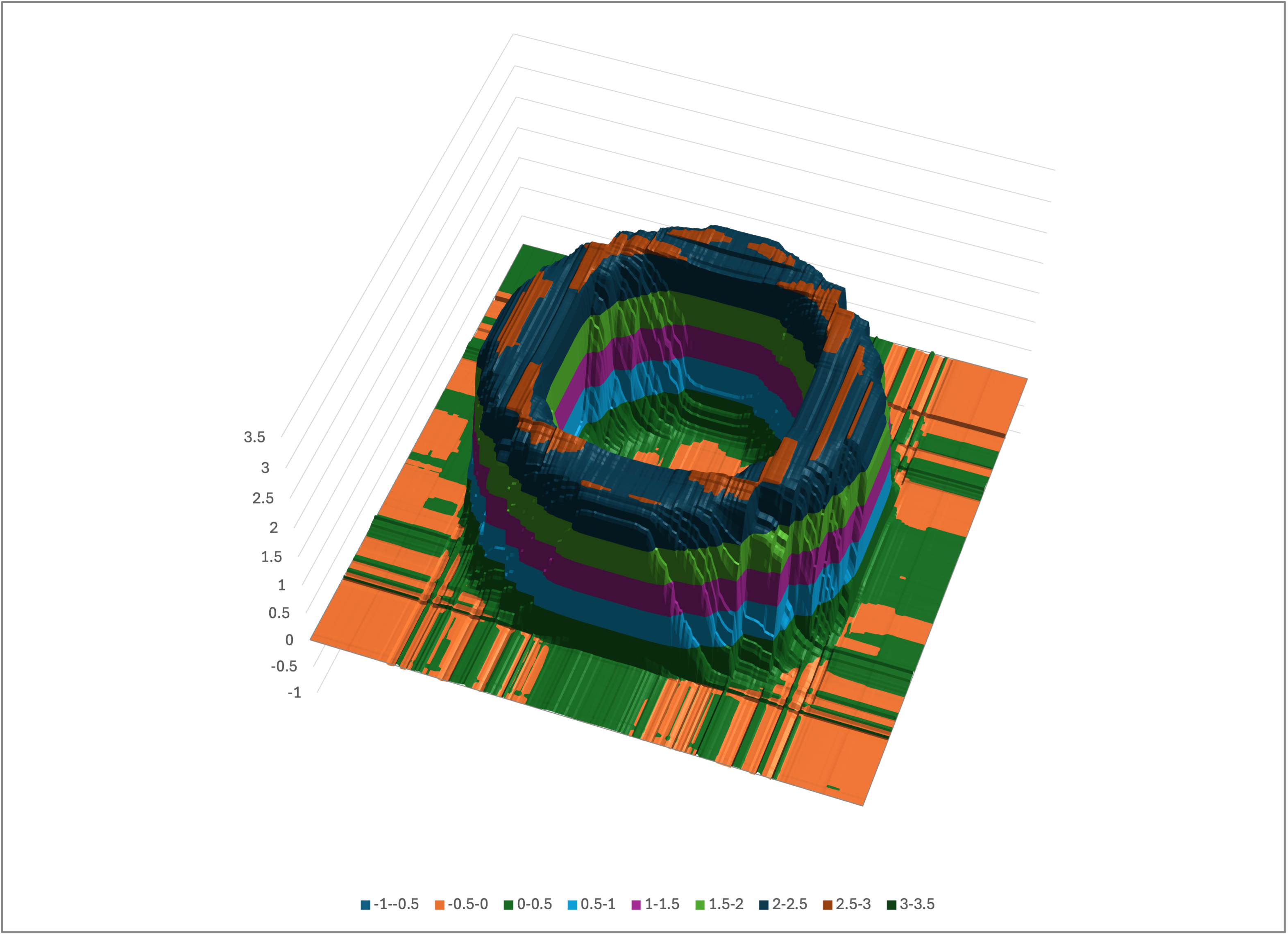
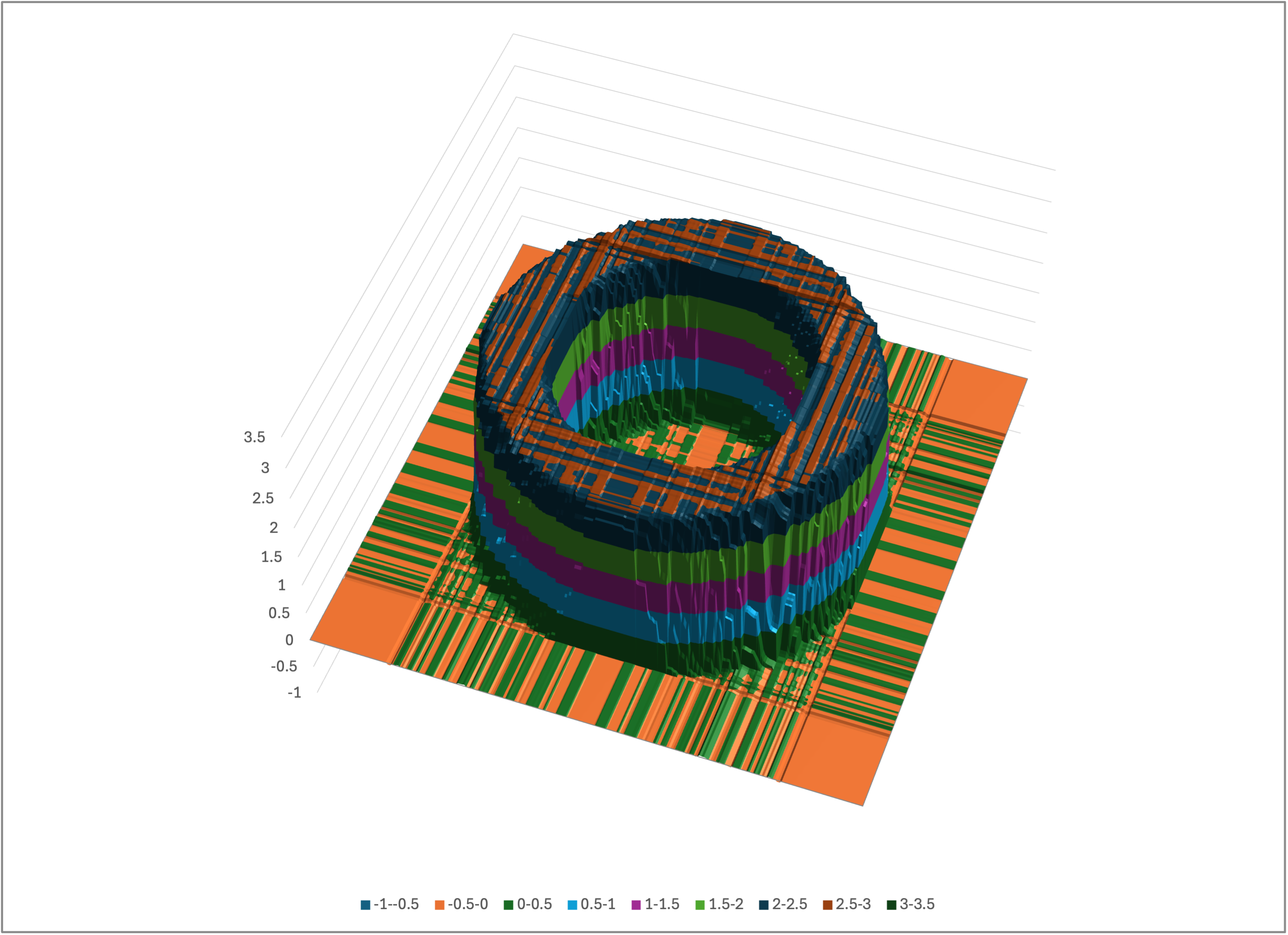
This converts the 255 x 255 = 65,025 training rows into a file tube-excel.csv with 255 rows and 255 columns, where each cell contains a z value. This file can be visualized as a surface chart in Excel (or you can use whichever graphing program you like):
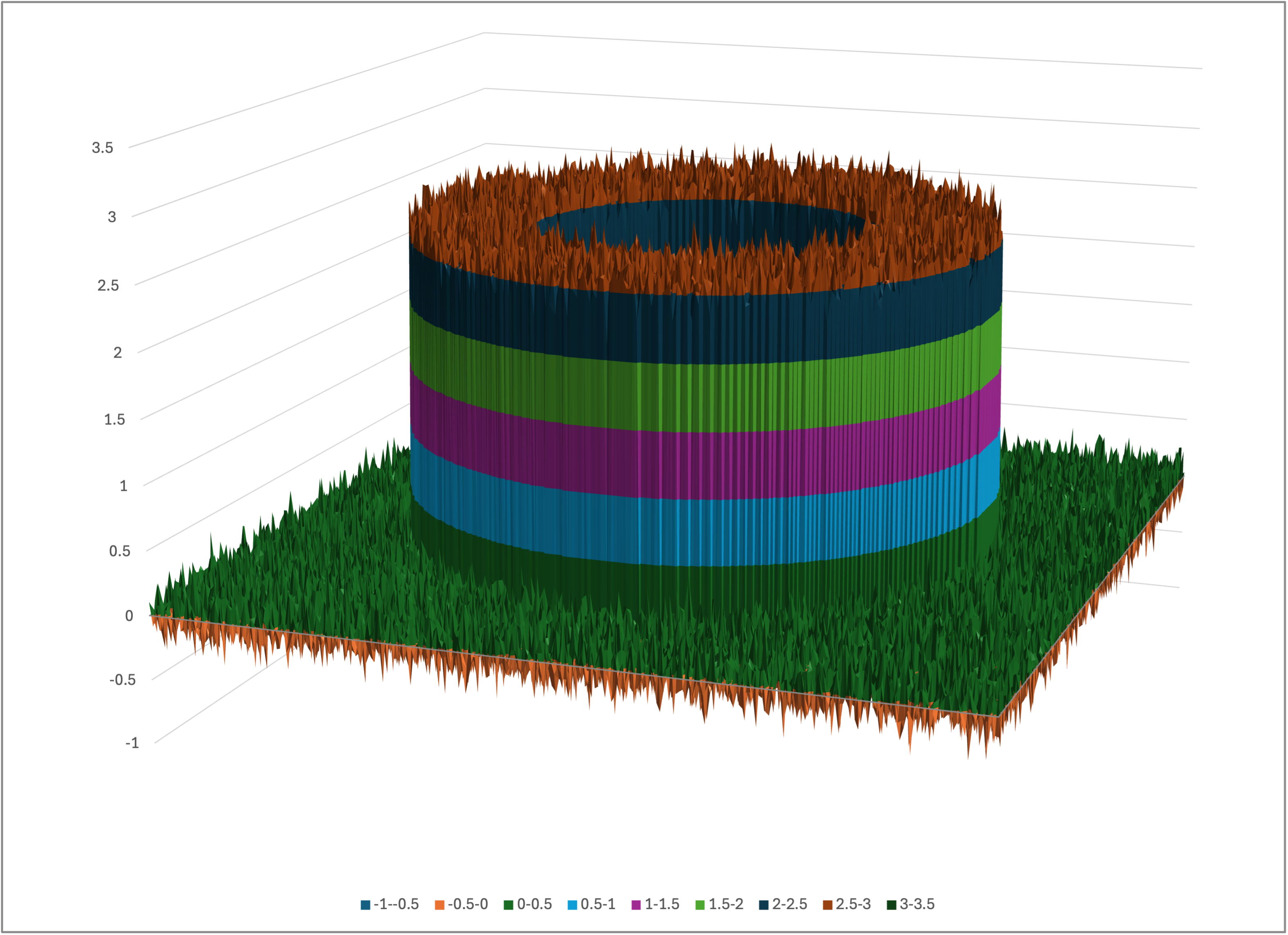
Excel’s surface chart of tube-excel.csv
Rotating the view, you can look down into the tube:
A rotated view of tube-excel.csv
Let’s run Bear on this dataset:
$ memory_bear tube.csv -l2 2m -otube-predictions.csv -stube
We can reformat the predictions file tube-predictions.csv using the same program as above:
$ intermediate_bear_tutorial_reformat tube-predictions.csv 255 tube-predictions-excel.csv
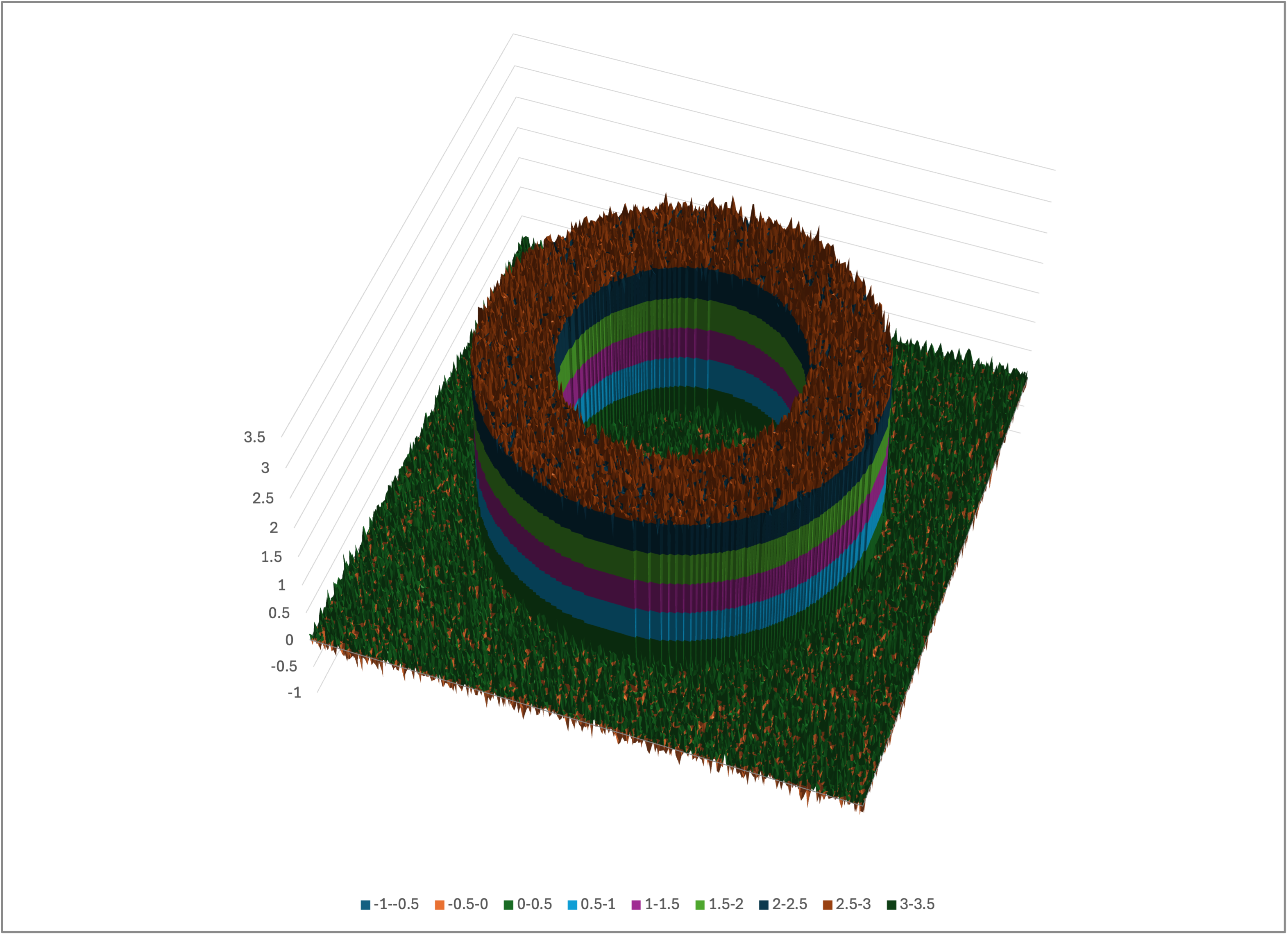
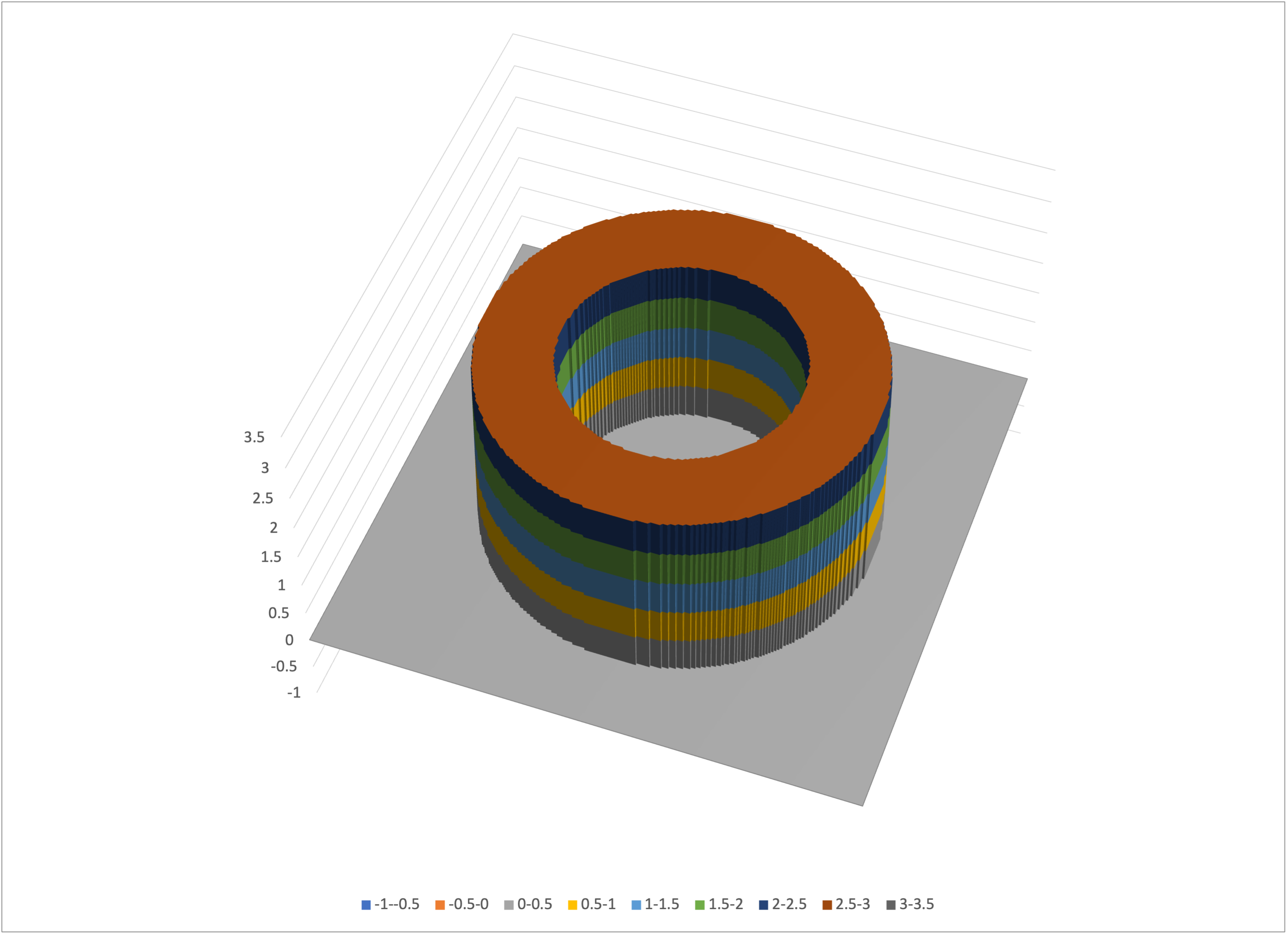
Opening tube-predictions-excel.csv in Excel (or whatever you are using) and creating a surface chart of it, you should see something like
Excel’s surface chart of tube-predictions-excel.csv
Again rotating, we can look down into the tube:
A rotated view of tube-predictions-excel.csv
That’s arguably a decent model of the real tube, that hasn’t overfit to the noise that we added to the training dataset.
In the above we added noise to the representation of the tube, to reflect the real world. Let’s instead create a dataset with no noise:
$ intermediate_bear_tutorial_data tube-nn.csv 255 /dev/null 50 -r 19680707
-e0
$ intermediate_bear_tutorial_reformat tube-nn.csv 255 tube-nn-excel.csv
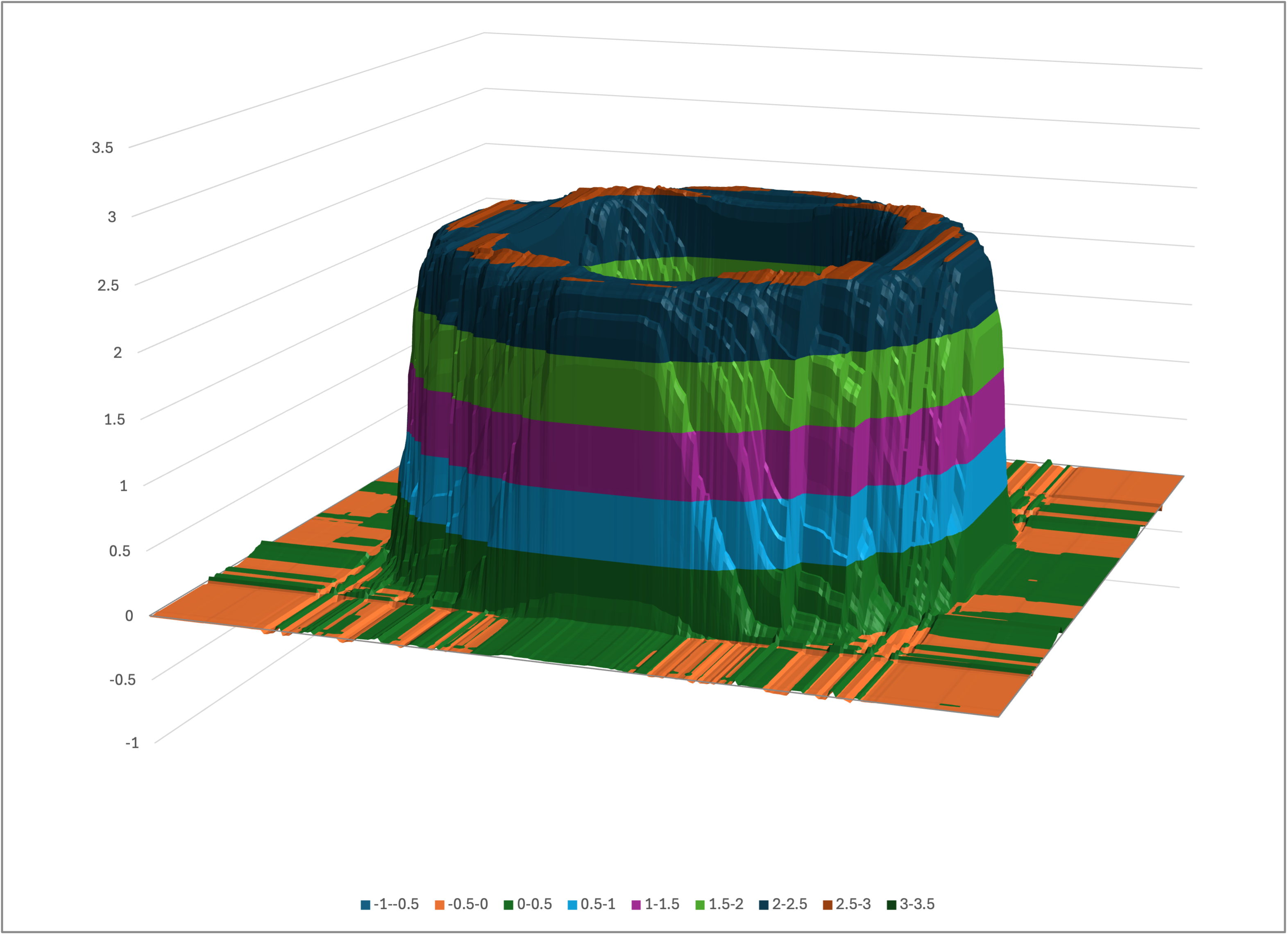
As expected, the tube is now noiseless:
Excel’s surface chart of tube-nn-excel.csv
A rotated view of tube-nn-excel.csv
If we run Bear on this noiseless data,
$ memory_bear tube-nn.csv -l2 2m -otube-nn-predictions.csv -stube-nn
$ intermediate_bear_tutorial_reformat tube-nn-predictions.csv 255
tube-nn-predictions-excel.csv
and look at the results,
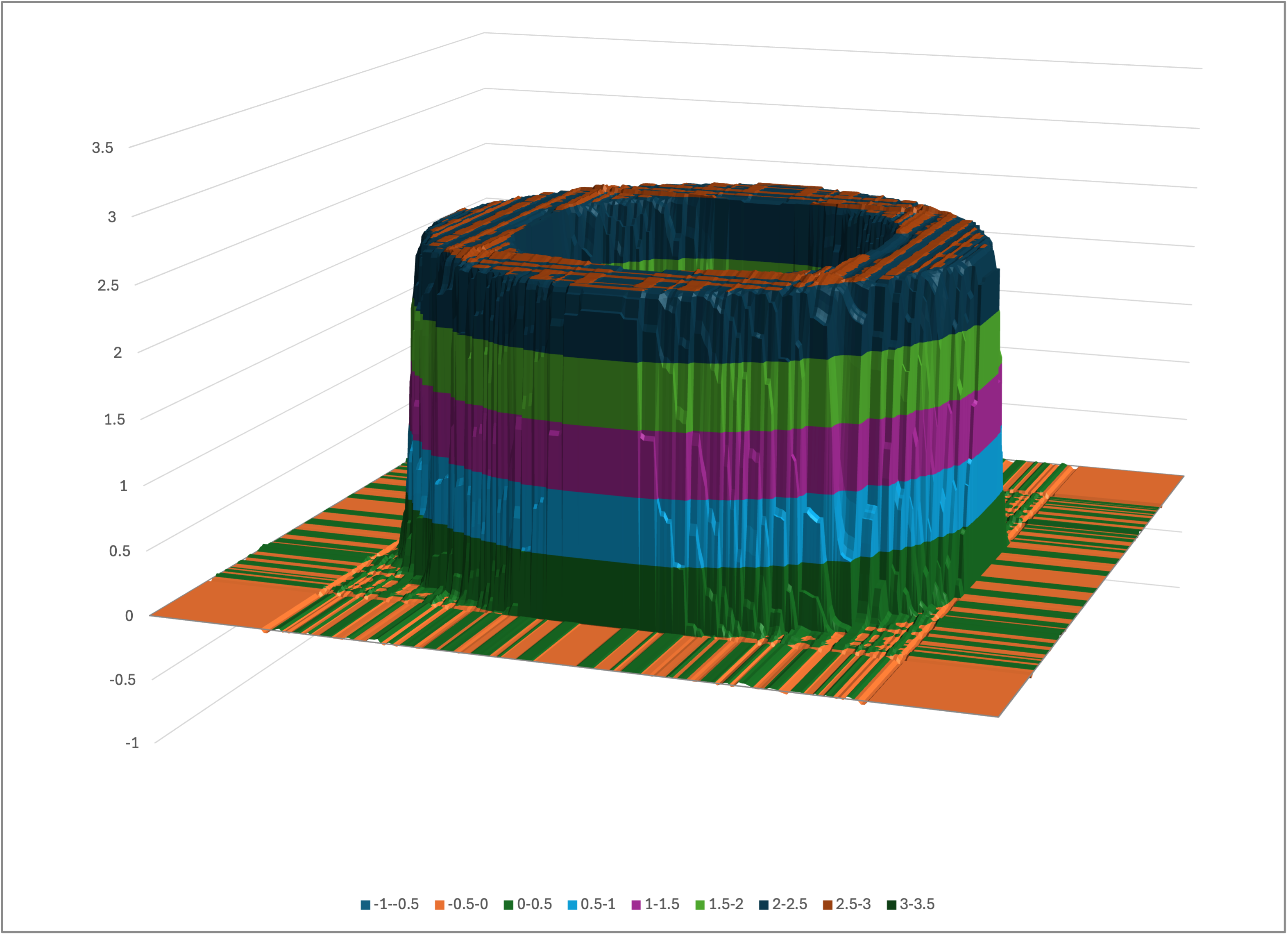
Excel’s surface chart of tube-nn-predictions-excel.csv
A rotated view of tube-nn-predictions-excel.csv
we see that Bear’s modeling is qualitatively the same as it was for the noisy data, but sharper. This again highlights that Bear does not overfit to noise in the data.
It was asked on Bear’s Facebook Page whether Bear could successfully solve the spiral classification problem, without being explicitly programmed for spiral shapes. I answered that it indeed could, provided that there was enough data provided for it to infer statistically significant shapes.
To show this, you can use the program spiral_classification_data to create such a dataset with a default 100,000 examples:
$ spiral_classification_data spiral.csv
which is of the same shape as the input data for Google’s neural net tutorial, which was the example given:
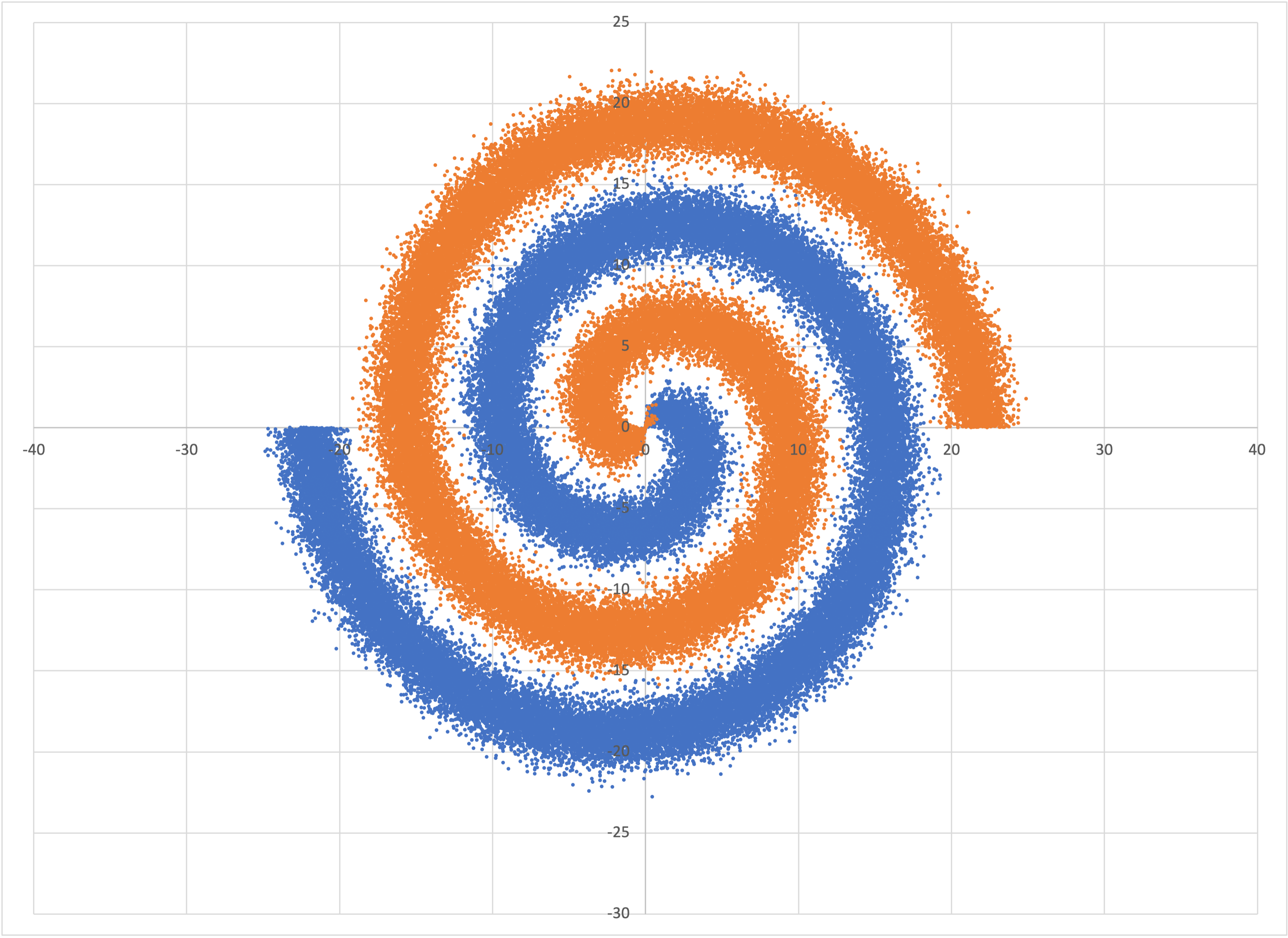
The data in spiral.csv
and also includes prediction rows, like what we had for the tube examples above.
You can run Bear on this dataset,
$ memory_bear spiral.csv 5m -sspiral -ospiral-predictions.csv -l2
and transform the predictions into an Excel-friendly format using the same program as above:
$ intermediate_bear_tutorial_reformat spiral-predictions.csv 255 spiral-excel.csv
yielding
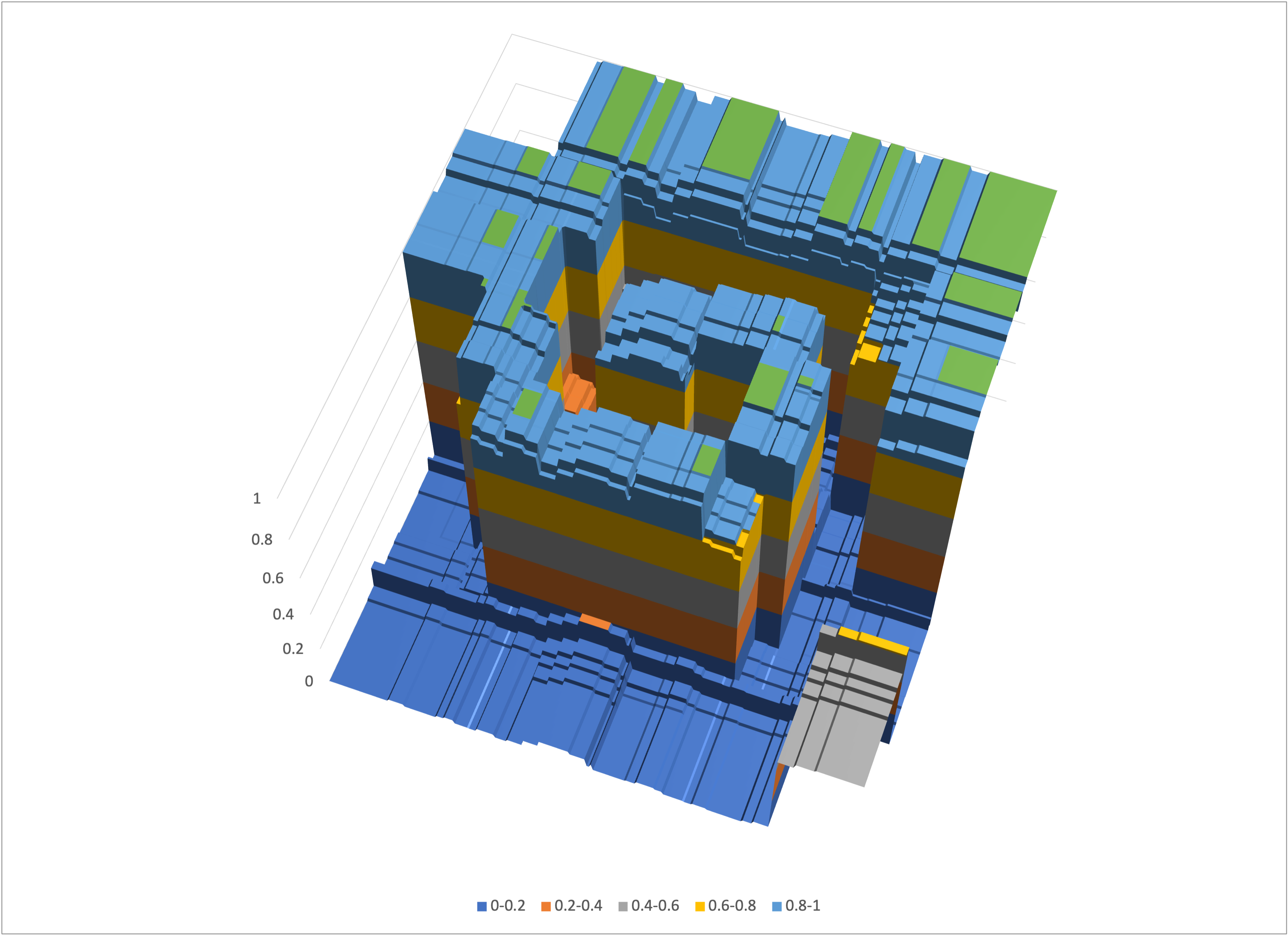
Bear’s predictions for spiral.csv
Note that Bear had essentially no data in the corners, so its predictions there just default to the overall mean probability across the entire square, namely, one-half.
Now that you have mastered the simple and intermediate tutorials, you may as well take a glance at advanced tutorial, right? (It will be beefed up soon.)
© 2023–2024 John Costella